
By John Cleary
My time over the summer of 2022 was spent working with the City of Baltimore’s Chief Data Officer Justin Elszasz on a dashboard for the mayor and/or Chief Administrative Officer of Baltimore City. The problem we worked on involved data that could help understand trash and other physical debris within communities. To measure these issues, we used data available around 311 service requests for trash, abandoned vehicles towing, and environmental citations: these had all been stresses for communities before the pandemic, but now with shortages in City staff they became larger problems. The mayor and CAO wanted information at their fingertips about these issues in order to determine how best to tackle them. We wanted to provide information which could get service requests, tows, and environmental citations completed in a timely and efficient manner. To that end, I created a dashboard – a collection visualizations and graphs – to provide the necessary information.
T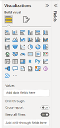 he reason we created the dashboard centered around a social good – getting service requests and other similar tasks completed quickly and efficiently. Achieving this required proper information, otherwise inefficient decisions get made and people lose time and patience. The major takeaway regarding this idea has been to critically think over what information to display and how to visualize said data. Fortunately, Justin was able to provide detailed information on what the Mayor and City Administrator would be looking for. Slicing up the data by date and council district, and limiting the timeframe to the last six months, all were ways the data was to be displayed. It became much easier to determine which visuals and data to use for the dashboard once these priorities had been set.
Justin determined Power BI (by Microsoft) best fit our needs for creating the dashboard. This program was built to visualize data and show trends so that questions get answered. A key part of Power BI turned was its Power Query, a space where data could be transformed, cleaned, and edited as needed. Over 30 distinct types of charts, graphs, tables templates came with the program that could be used to frame our data, as shown in the screenshot clip to the left. We figured the best visualizations mostly included tables, along with bar and circular graphs. This kept the information simple yet showed off the data we wanted readers of our dashboard to see.
Data came from Open Baltimore, a Baltimore City website with free, publicly available data (https://data.baltimorecity.gov/search).
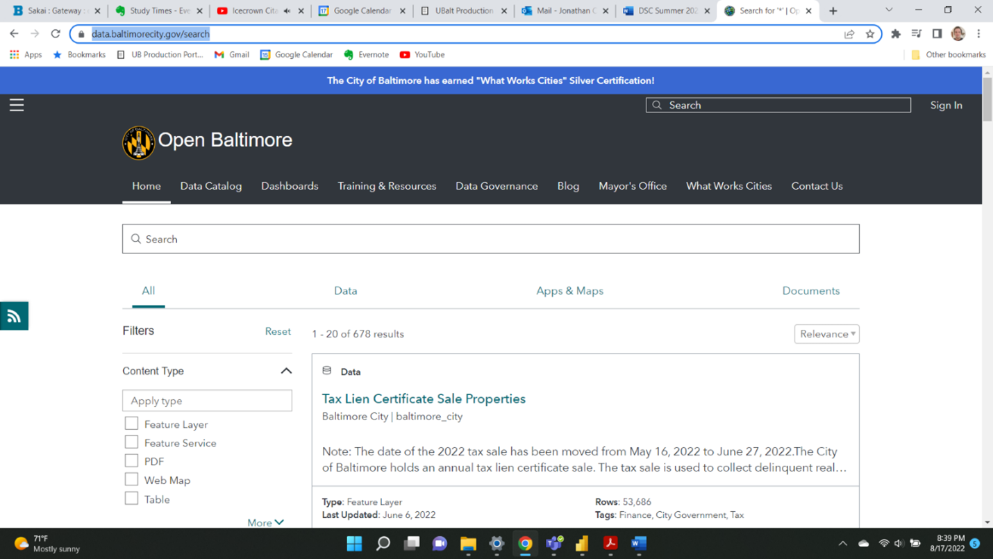
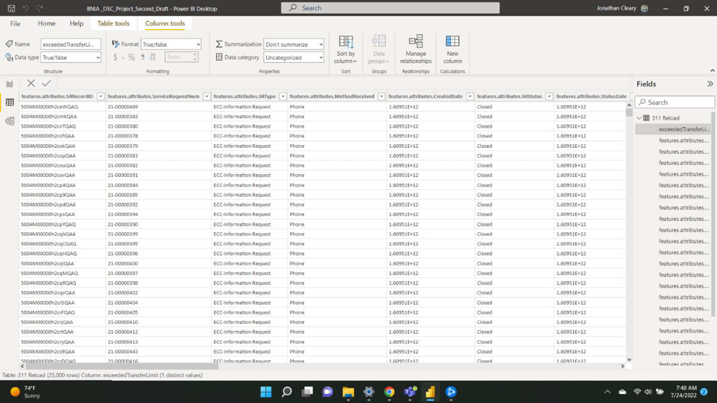
Three different datasets were accessed, one with data on the 311 service requests, one with towing data, and one with environmental citations data. An Application Programming Interface (API) from Open Baltimore was used to link the data from the website to the dashboard in Power BI. This let us get the data we needed without having to download a copy of it, and the data itself would automatically update. Data would remain fresh and relevant this way. Given that we were using an API to access the data directly on our dashboard, data had to be transformed within the Power BI’s Power Query (see screenshot below), as opposed to Excel or some other program such as OpenRefine. An example of a transformation was changing the date and time data from epoch time to regular date and time format (see an example of epoch time in the far-right column in the screenshot of the Power Query below). Also, for the service requests table, data had to be transformed so that we could tell how many services requests were finished before or after their due date. A dataset containing a table of dates was also added to the program to link all our datasets by date, making it easier to manipulate the visualizations on the dashboard, as well as a table containing City Council district numbers.
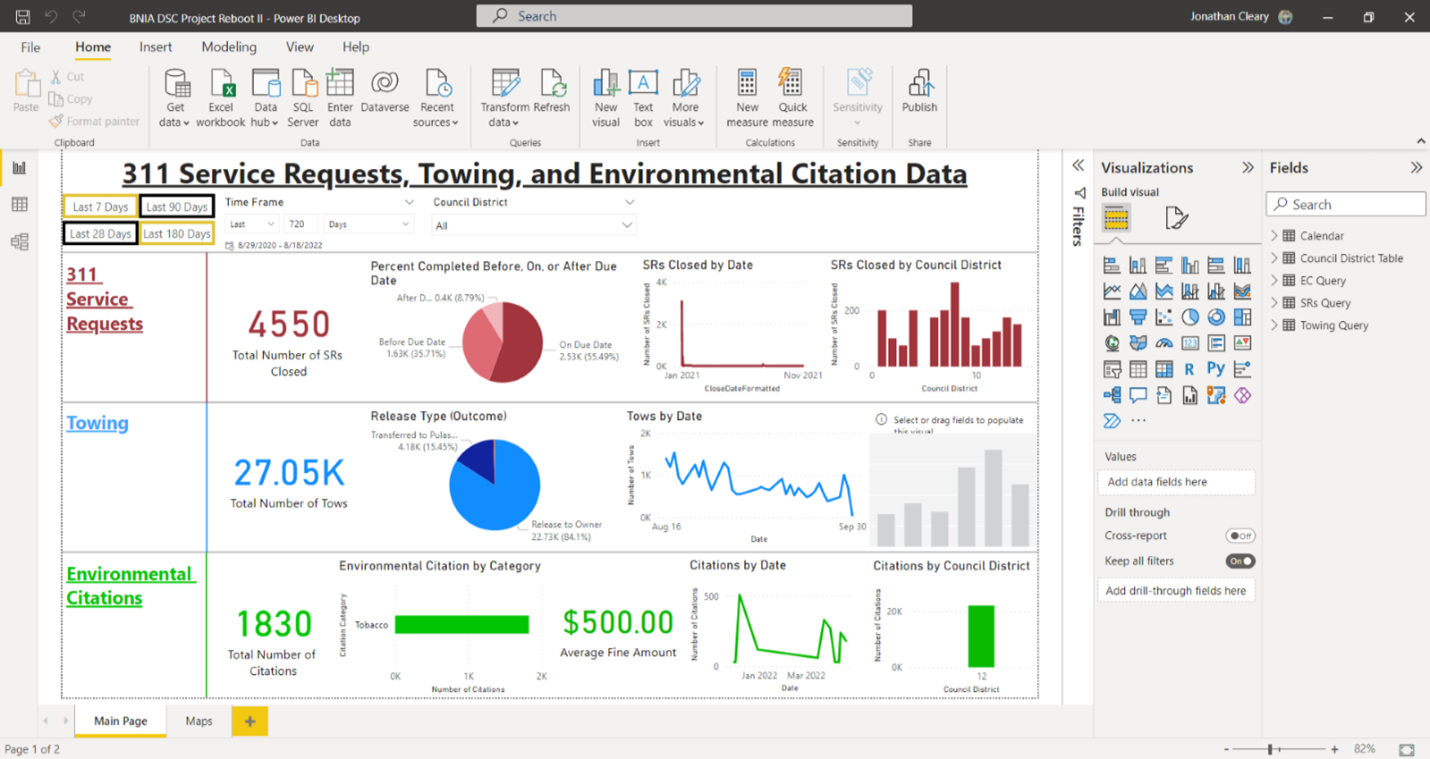
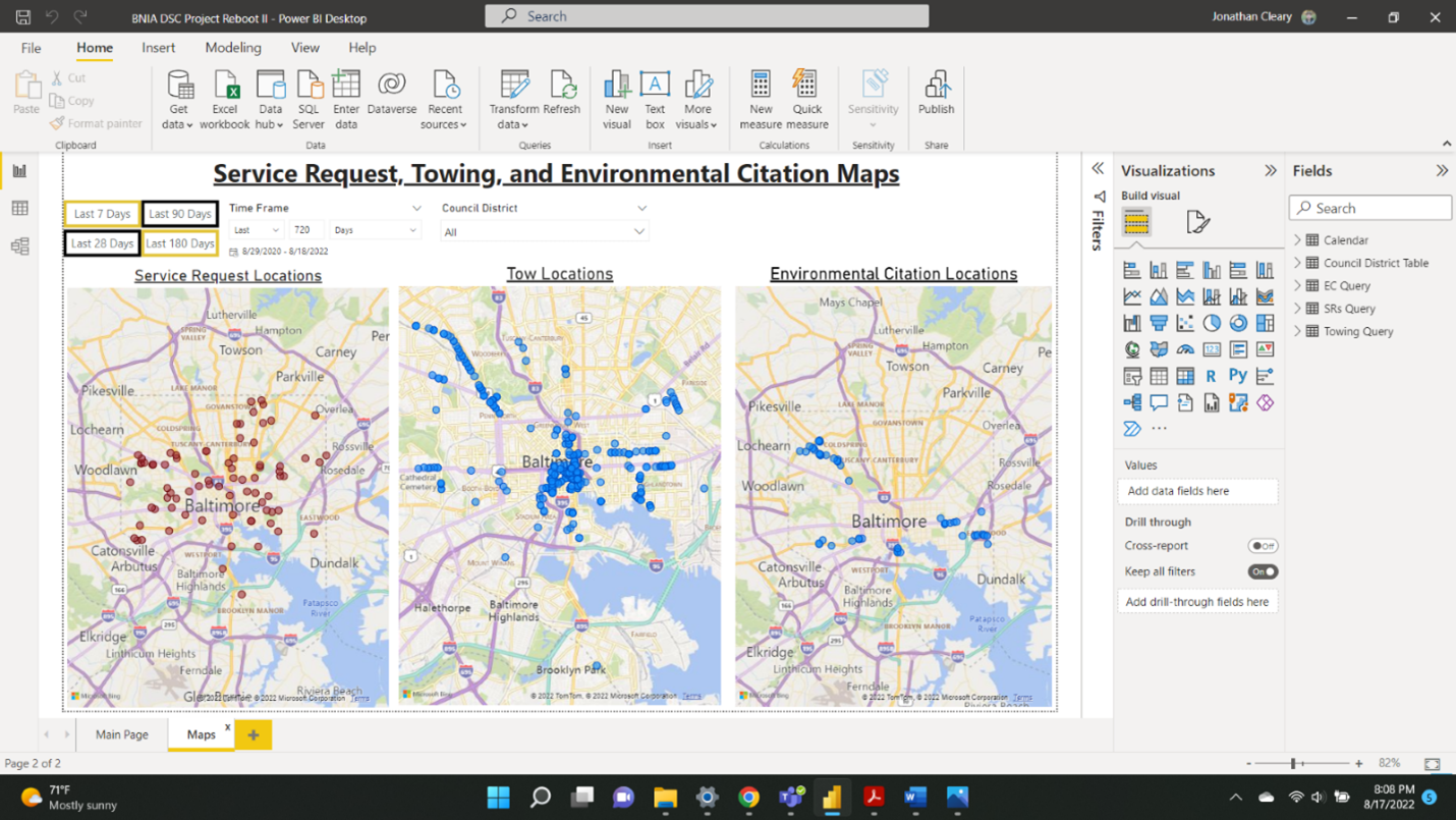
As of this writing, the dashboard looks like the screenshots below. It has two pages, like the way one can make multiple pages in Excel. Below are screenshots of both pages. On the first page, visualizations are divided into categories and color coded based on whether their data came from the service request table, towing data table, or environmental citations table. Buttons and slicers are at the top of the page, and can be used to select data from a previous amount of time, or by council district. As of this writing, we do not have towing data by council district, which is a problem we are currently working to solve. Another issue we are working on is the fact that the API we used does automatically update the data we have. On the second page, three maps show the locations of the service requests, tows, and environmental citations. That page too, has the buttons and slicers which allow a reader to determine which timeframe or council district to view the data in.
Creating this dashboard was the first time I had ever worked with data this in depth, so naturally I learned a lot. Some realizations were relevant to the project itself, others to data science in general. Specific to this project, I had to learn Power BI from scratch. Several YouTube videos, mainly from people who worked at Microsoft helped immensely with this process. Two such pages which I watched the most were Pragmatic Works (https://www.youtube.com/c/PragmaticWorks) and Guy in a Cube (https://www.youtube.com/c/GuyinaCube). Both channels have dozens of videos, almost all of them about some aspect of Power BI or programs that go along with Power BI. The basics of Power BI were relatively easy to learn, including what visuals the program had and how to get data into the program. Nuances which took longer to learn included how to link datasets so they could all be manipulated by one visual, and how to format time columns in the data so they work properly with the visuals.
General lessons learned regarding data science centered around making sure data was clean, filtered, and formatted properly. Clean data leads to visualizations properly working, which means the trends and information we wanted to see was displayed. I came to realize that manipulation of data constituted a large amount of the time spent on this project. This makes sense – I heard from one source that 90% of time spent on a project like this involved data cleaning or transforming.
Moving forward, I cannot wait to see what specifically happens with the dashboard if and when it is completed. Also, I look forward to utilizing Power BI more in the future, and I am glad I got this opportunity this summer.