
By Bozkurt Karaoglan
According to Commissioner Michael S. Harrison, one of the guiding principles of violent crime reduction strategy in our city is: “Intelligence-led policing that focuses on leveraging intelligence and research analysis to drive operational and deployment decisions.” ( Baltimore Police Department Crime Reduction Strategy, June, 2019) Currently, BPD uses an Operations Dashboard to monitor and assess their entire operations. This Dashboard is capable of providing real-time information to both the officer on the street ad the executive command. As the Commissioner mentions, the Dashboard is expected to evolve over time by including more analytical tools and filtering capabilities to support the evidence-based and data driven crime reduction strategy.
Our project was to contribute an additional layer to this Dashboard by visualizing the Criminal Debriefing Dataset which BPD collects for all nine districts of our city. The dataset is the product of BPD’s “ continuous improvement and reassessment…” strategy which necessitates quantifying the intelligence-gathering efforts of its officers.
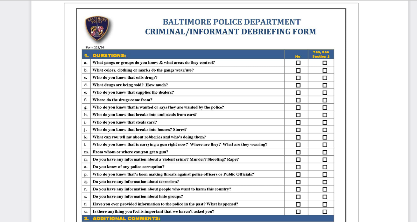
A criminal debriefing is a formalized procedure where a police officer attempts to solicit useful information from an arrestee or informant which may help to solve other criminal cases. Participation in a criminal debriefing is voluntary and it takes the form of a checklist of questions administered by the officer. The questionnaire for the briefing is publicly available at the BPD website.
https://www.baltimorepolice.org/transparency/bpd-policies/1012-criminalinformant-debriefing-form
The information included in the dataset were: the names and the badge numbers of the officers who conducted the debriefing, the names and badge numbers of the supervisors who oversaw the debriefings, and the date/time of the debriefings in all nine districts. The names of the arrestee or the informant was classified, and we had neither access nor the need for our visualization.
The intended users of the dashboard were the executive command who needed the basic counts, percentages, and the distributions of the successful debriefings by districts. A successful debriefing is when an arrestee agrees to answer formalized questions which may or may not help to solve other crimes. In the data sheet, successful debriefings were quantified as Boolean value of 1, and unsuccessful debriefings as value of 0. The purpose of the dashboard was to enable users to drill down with ease on specific district and supervisor counts and percentages through filtering the dataset by date ranges. The users also needed a bird’s eye view of intelligence gathering efforts carried out in all nine districts in units of percentages and counts to be able to assess the long term trajectory of such efforts.
Our first step was to understand the meaning of the dataset. Because the dashboard was for internal use only and the dataset had domain specific variable names. Understanding how the variables related to each other was necessary to create correct charts and valid calculations. The Baltimore Police Department explained all the variables and how they calculated relevant statistics based on these variables.
To gain access to the data we had to sign a confidentiality contract. At time we received the dataset, it contained 16 different columns and over 6000 observations. There were 12 text type variables, two date variables, one integer variable, and one Boolean variable.
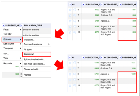
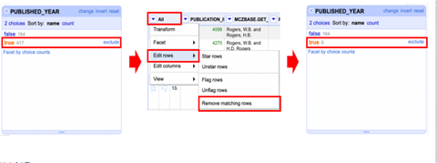
Initially, there was redundant information in the dataset. We used OpenRefine software (formerly known as GoogleRefine) for cleaning and transforming the raw data. We excluded the columns that contained redundant information using OpenRefine’s faceting tool. We also utilized Excel to sort and remove-duplicate values. Additionally, once we cleaned the dataset we verified with BPD that our dataset was valid and it did not exclude any relevant data.
Because BPD uses Tableau visual analytics software for their Dashboard, we prepared more than a dozen Tableau sheets with basic charts and statistics just to make sure we chose the most needed data for the visualization. Once we decided which sheets to use, we formulated our parameters and calculated fields. The Parameters and Calculated Fields are Tableau specific terminology, which create links between variables. They are also needed for filtering actions. Although Tableau automates the choice of chart for variables, users still have options in choosing their own charts. During our project we realized that bar charts and column charts were the best fit for our data types.
Once we decided which variables to use, we formulated two parameters: one for the date range and one for the calculation of debriefing percentages. Also, we created four calculated fields for filtering criteria. And we wrote a simple SQL query to create a date filter. Before we finalized the visual layout, we verified our parameters and calculated fields to ensure the validity of counts and percentages for each district and the supervisor.
Having never used Tableau before this project, we realized that the learning curve for Tableau can be short but confusing.
Although our project was not for the public use, we are confident that our project provided that “additional layer” the operational dashboard needed.
We hope that our dashboard will enable the executive command of Baltimore Police Department to see hidden relations in their criminal debriefing dataset and provide new insights.
References
https://www.baltimorepolice.org/sites/default/files/General%20Website%20PDFs/BPD_Crime_Reduction_Plan.pdf)