
By Charles Lac
Criminal intelligence is vital for solving crimes. However, it is difficult to quantify such information because the amount of information gathered strictly depends on the cooperation and truthfulness of the person arrested. There is also the well-known cultural stigma attached to talking to police officers about a crime and people who may be involved in other criminal activities. A quantified approach to the basic process of criminal intelligence can provide important statistics which may help the police department to prioritize their focus and resources where they think it fits best.
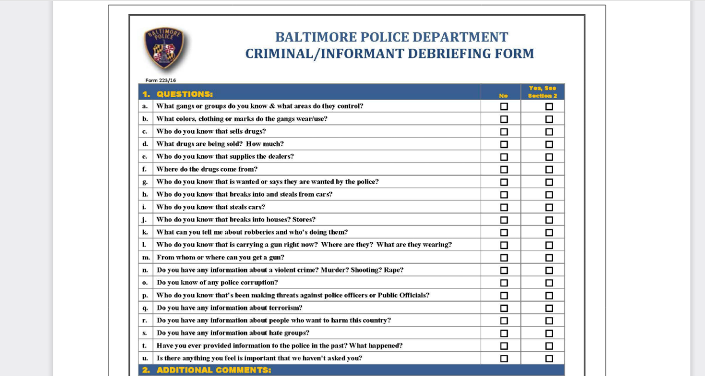
Our project was to prepare a Tableau dashboard to visualize the criminal debriefing dataset for all nine districts of Baltimore Police Department (BPD). A criminal debriefing is a formalized police procedure when a police officer attempts to solicit useful information from an arrestee or informant which may help to solve other criminal cases. Participation in a criminal debriefing is voluntary for the arrestee or informant and takes the form of a checklist of questions administered by the police officer. The questionnaire for the briefing is publicly available at the BPD website.
The information included in the dataset were: the names and the badge numbers of the officers who conducted the debriefing, the names and badge numbers of the supervisors who oversaw the debriefings, and the date/time of the debriefings. The names of the arrestee or the informant was classified, and we had neither access nor the need for our visualization.
The intended users of the dashboard were the BCPD executive command who needed the basic counts, percentages, and the distributions of the successful debriefings by districts. A successful debriefing is when an arrestee agrees to an arrest interview. In the data sheet, successful debriefings are noted as a Boolean value of 1, with unsuccessful debriefings being 0. They wanted to be able to drill down with ease on specific districts and filter the dataset by date ranges. They also needed a bird’s eye view of all nine districts with their debriefing percentages.
Our first step was to understand the meaning of the dataset because the dashboard was for internal use only and the debriefing dataset had domain specific variable names. Understanding how the variables related to each other was necessary to create correct charts and valid calculations. The Baltimore Police Department explained all the variables and how they calculated relevant statistics based on these variables.
To gain access to the data we had to sign a confidentiality contract. The data contained 16 different columns and over 6,000 observations. There were 12 text type variables, two date type, one integer type, and one Boolean type. Due to the vast amount of data and the specificity of the dashboard due to the BPD’s needs, we had to prepare a usable data sheet for Tableau.
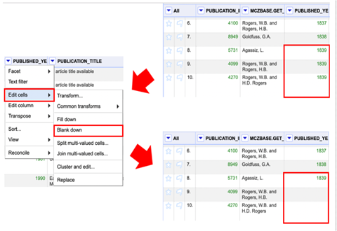
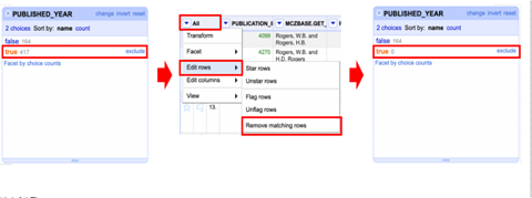
There were concerns of redundant information, which we used OpenRefine and Excel to test if the information was truly redundant. OpenRefine is an application for data cleanup and transformation. We erased the columns that contained redundant information. Additionally, we found that in a specific column there were repeating variables. The column was expected to contain only unique values and so we used a combination of OpenRefine and Excel to merge all non-unique values. In OpenRefine, we used the facet tool to view repeating cells and merge them. In Excel, we used sort and remove duplicate tools to merge non-unique values. We tried multiple methods to see which option provides us the most accurate representation of the data. We used Excel to run frequency counts to check the validity of our merger. Additionally, that information was used to check with BPD to let them know how we merged the non-unique values and check if they were okay with losing a portion of the data. A memo was planned to be added to the final dashboard to indicate how we merged non-unique values for subsequent data, however, BCPD provided us with a new data sheet that contained only unique values.
Our data is sensitive, so we will be providing an example of another data set and how we merged unique values.
We used Tableau as the platform for this analysis. BPD had existing visualizations using Tableau and wanted to maintain consistency in their tools.
Next step was to prepare separate sheets which would eventually make up the dashboard. Initially we prepared more than a dozen Tableau sheets with basic charts and statistics just to make sure we chose the most needed data for the visualization. Once we decided which sheets to use, we formulated our parameters and calculated fields. The Parameters and Calculated Fields are Tableau specific terminology, which create links between variables at basic calculation levels so that the user can discover hidden relations by automated visualizations. They are also needed for filtering actions which can yield hidden relations between variables throughout the dataset. Tableau uses SQL (Structured Query Language) for queries in its user-defined filters.
Although Tableau automates the choice of chart for variables, users still have options in choosing their own charts. During our project we realized that bar charts and column charts were the best fit for our data types.
Once we decided which variables were the most relevant, we formulated two parameters: one for the date range and one for the calculation of debriefing percentages. Also, we created four calculated fields which enabled us to filter the data set by date range. Finally, we created a date filter which applied to all the sheets. Before we moved on to finalizing the visual layout for the dashboard, we tested our parameters and calculated fields to ensure we get the valid counts and percentages for each district and the supervisor.
Having never used Tableau before this project, we realized that although statistics has its own terminology, commercial data science products such as Tableau also have their own terminology to learn. The learning curve for Tableau can be short but confusing. Because the chart generation is automated, Tableau can lead users to feel false confidence since automation black boxes the analytical process. Keeping in constant contact with the host organization was critical for us in our trials and errors with Tableau.
Although our project was not for the public use, we think the dashboard we prepared provided meaningful and relevant charts with no less user-friendly visualizations. We hope that our dashboard will enable the executive command of Baltimore Police Department to see hidden relations in their criminal debriefing dataset and provide new insights. Successful visual analytics of any data set shouldn’t just offer possible solutions to the problem at hand, but it should also stimulate the audience to ask new questions.