By Jonathon Cleary
Summary
For the Fall 2022 Data Science Corps, my project involved looking at the correlation between demolitions, homicides, and shootings in Baltimore City for the years 2019 and 2020. In one of their projects, BNIA (Baltimore Neighborhood Indicators Alliance) had determined there was a correlation, and the idea for my project was to look deeper to see specifically where the incidents had occurred and if there were any patterns in the data. To visualize the data, ArcGIS Pro was used, with an account supplied by BNIA. New layers and maps were created to try and get the information we were looking for, along with some analysis within the program SPSS.
Why This Project?
The reason we created our maps centered around trying to figure out if demolitions in Baltimore City were correlated with homicides; Homicides have always been a relative problem in Baltimore City, but each of the past eight years have seen over 300 homicides in the city. Knowing one of the potential causes of homicides, or the conditions leading to them, is something many people would want to know, from the public to the mayor’s office.
Tools Used
ArcGIS Pro
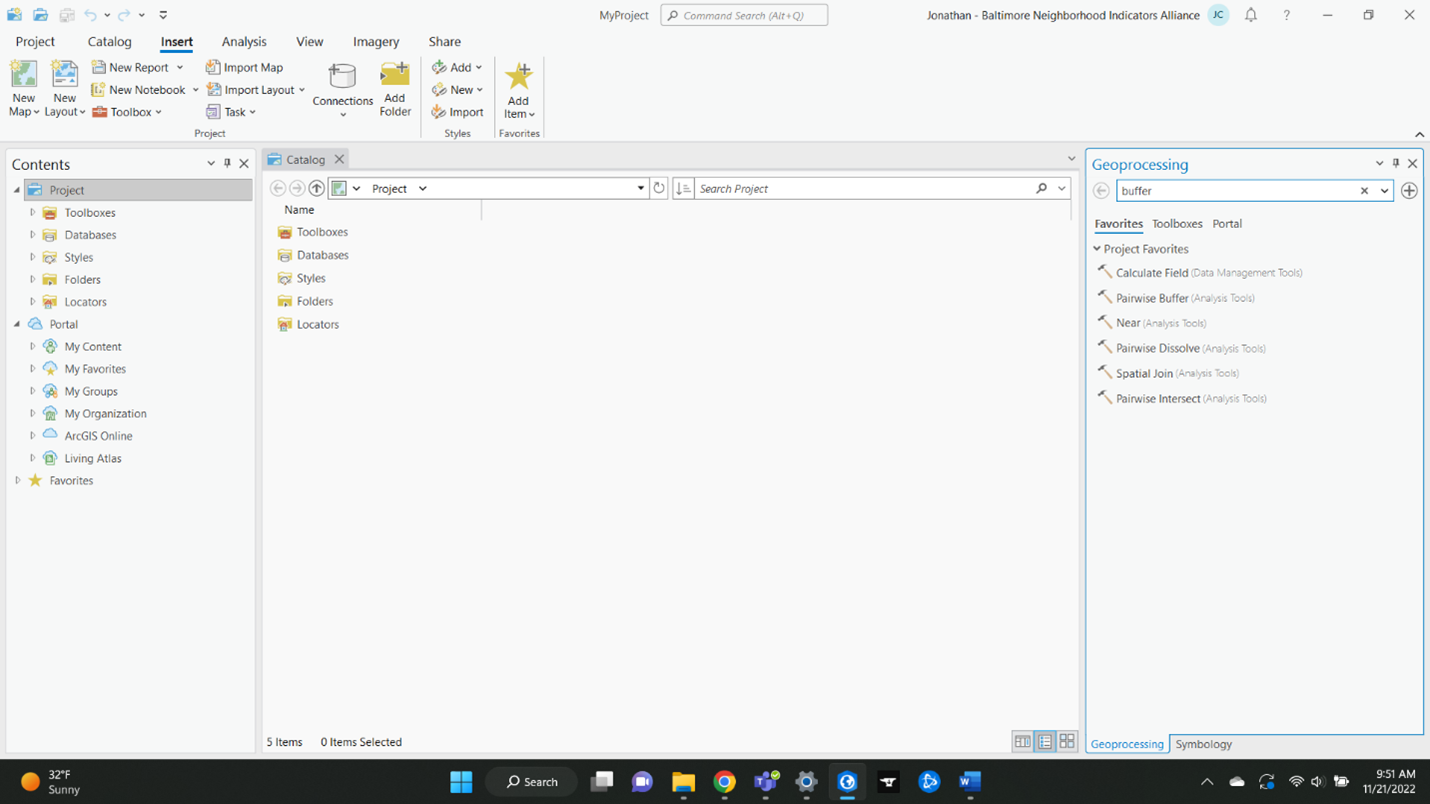
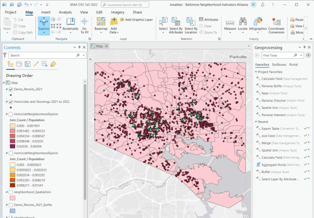
For those not familiar with the program, it is made by the company ESRI (Environmental Systems Research Institute). ESRI makes several products that utilize Geographic Information Systems (GIS) data, which can be visualized and analyzed to answer real world questions. Their home website is https://www.esri.com/en-us/home. ArcGIS Pro is ESRI’s top of the line product, with the most functions (there are several dozen tools available for users to manipulate data) and the most streamlined approach to data analysis (according to ESRI). Learning all their tools is nearly impossible, but there are several that are commonly used and handy to know, such as a join, or spatial join. Below is a picture of their screen when starting a new project. Since ESRI has partnered with Microsoft, there is a familiar ribbon of contents at the top of the screen. Below that, the contents pane on the left will contain data layers once some are added to the project, the center pane is where the map will be displayed, and the geoprocessing pane on the far right contains all the many tools ArcGIS Pro has to offer for data manipulation and analysis.
Open Baltimore
Baltimore City has a collection of data files which it shares with the public. Its main website is https://data.baltimorecity.gov/search. Several hundred files are available for public use, covering several aspects of the city, such as health, art and culture, the environment, or public works. Several relevant and pertinent dashboards are displayed on their home page as well, such as Covid counts. Interestingly, many datasets found on the site were provided by BNIA. Below is a screenshot from their home page.

SPSS
This IBM product focuses on statistical analysis. It, like many related products, has data brought into it, and it provides many tools that can be used to manipulate and analyze the data. Data can also be cleaned. The main two parts of SPSS is the data view, which shows the data that is put in by the user (see first image below) and the output view, where the statistical analysis, graphical outputs or whatever else was done in the data view is shown (see second image below).
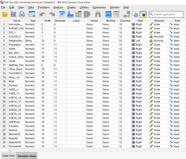
SPSS Data View. Shows the data itself, as well as the categories within the dataset (seen here)
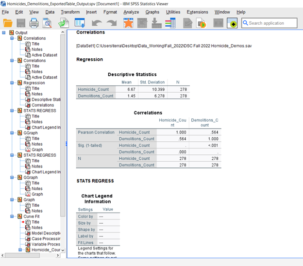
SPSS Output View. Shows the tables created from the data analysis
The Process
First, data needed to be gathered. The first of three datasets used was the Part 1 crime data (https://data.baltimorecity.gov/datasets/part-1-crime-data-/explore)from Open Baltimore, a free data service run by the city. BNIA then supplied the dataset that contained the demolition permits for Baltimore City, and both datasets were then brought into ArcGIS Pro.
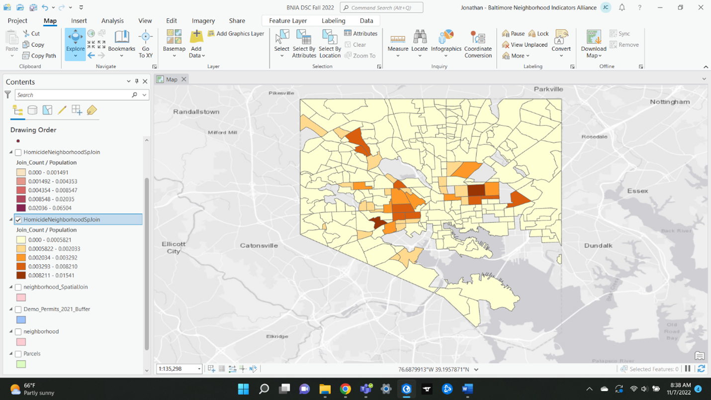
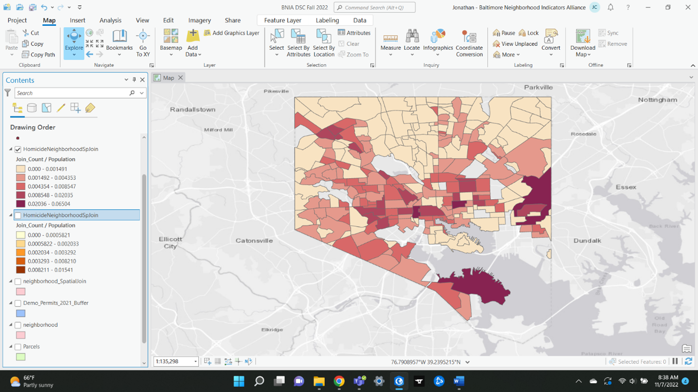
Both datasets had to be filtered down within ArcGIS Pro; the crime data was filtered down so that it only showed homicides and shootings, and both datasets had to be filtered down, so they only covered the years 2019 and 2020. Next, the dataset containing the city and its neighborhoods was downloaded from Open Baltimore and added into ArcGIS Pro (see Figure A in results). From there, the data from the homicides and shootings and demolitions permits datasets was aggregated and then spatially joined to the neighborhoods layer, so that each neighborhood had data for each homicide, shooting, and demolition permit within the neighborhood. The symbology feature was then used to make maps of the neighborhoods colored to show the rate of homicide, shooting, and demolition permit per population (see Figures B and C in results).
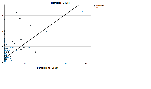
After that, the datasets for homicides/shootings and demolition permits were brought into SPSS, and statistical analysis was performed using the correlation and regression functions. A table and graph were the highlights of the outputs gained from SPSS (see Figures D and E in results.)
Back in ArcGIS, the next major idea was to determine which came first, homicides or demolitions. First, a buffer was set up to determine which homicides and demolitions were near each other. The buffer had a radius of 750 feet, which covers a little over the length of a city block. Next, the layer with the buffer and the layer containing the homicides were spatially joined; the attribute table of the buffer layer then contained attributes for both the demolitions and homicides. In determining whether the demolition or the homicide came first, a new column was made in that attribute table, in which the date the homicide occurred was subtracted from the date the corresponding demolition was done. This gave either a negative or positive number – positive meaning the demolition had occurred first, negative meaning the homicide had occurred first. The actual calculation of the field was done in Excel, seeing as ArcGIS did not produce the results we were looking for.
Next Steps
Visually displaying which came first, a demolition or the homicides within its buffer would be the next step in the process. For this, the table in Excel would need to be brought into ArcGIS, then joined with a layer that contained spatial information, the layer that was the spatial join between the demolition buffer and homicides within their buffer. This would allow the symbolization of the new column created by subtracting the homicide date from the demolition date. We would then be able to tell which came first (homicides or demolitions) in which areas and come up with questions about those results or make some assumptions about the data. Another next step to take would be to recreate the resulting maps but with the homicide and demolition rates normalized by population.
Results
a) the pink neighborhoods layer, overlayed with the homicides layer (red) and demolitions layer (green). At this time, the neighborhoods had been spatially joined with the homicides layer, and the symbology had been used to show the different neighborhoods number of homicides normalized by population
b) the neighborhoods within the city colored to show the number of demolitions in each neighborhood normalized by population in that neighborhood. Darker areas indicate where there have been more demolitions per population, with many of the neighborhoods having no demolitions in them at all. Note how most of the demolitions are concentrated within more central, older neighborhoods of the city.
c) the neighborhoods within the city colored to show the number of homicides in each neighborhood normalized by population in that neighborhood. Unfortunately, many neighborhoods have had homicides in them, with the exception being several of the more northern neighborhoods. The two darkest neighborhoods in the south and east parts of the city may have had very few people in them which is why the homicide rate was so high in them.
d) the SPSS output table for the correlation analysis between homicides and shootings, and demolitions. The homicide and demolition count are both 278 because that is how many neighborhoods there are in Baltimore City, and how thus how many polygons within the city there are on the resulting maps above. Note the correlation value between demolitions and homicides (.564) correlates with the regression line in figure e. Also, there is a 1.000 correlation between homicide/homicide and demolition/demolition because those are the same variables. A .564 correlation means there is a positive correlation between the two variables. The next step would be to find the correlation between homicides and demolitions normalized by population.
| Correlations | |||
| Homicide Count | Demolitions Count | ||
| Pearson Correlation | Homicide Count | 1.000 | .564 |
| Demolitions Count | .564 | 1.000 | |
| Sig. (1-tailed) | Homicide Count | . | <.001 |
| Demolitions Count | .000 | . | |
| N | Homicide Count | 278 | 278 |
| Demolitions Count | 278 | 278 | |
e) the regression graph between homicides and demolition permits. Blue dots note the correlation between homicides and demolitions in each neighborhood. Many neighborhoods had either no demolitions or no homicides, so the correlation is exceptionally low in those areas. The line on the graph is the regression line which represents the correlation between homicides and demolitions for the whole city. Therefore, it makes sense that the correlation line has the same slope value as the Pearson correlation value from the previous result.